How To Paint Landscapes With Watercolors
Painting landscapes with watercolors is an art form celebrated for its luminous washes, expressive brushwork, and the unique interplay between pigment and paper. This medium offers both seasoned artists and beginners a way to capture nature’s beauty with freshness and spontaneity.
Watercolor landscapes can evoke mood, atmosphere, and the subtle shifts of light, making them a favorite subject for artists worldwide. Whether you’re striving for realism or impressionistic flair, mastering landscape painting with watercolors opens doors to creative expression and technical growth.
Despite its reputation for being unforgiving, watercolor is actually one of the most versatile and rewarding mediums for landscape art. With careful planning, practice, and a few proven techniques, you can paint vibrant forests, tranquil lakes, and dramatic skies. In my experience, even those new to watercolors can produce compelling landscapes by understanding composition, color mixing, and brush control.
This guide will equip you with essential tools, practical strategies, and insider tips for painting landscapes with watercolors, drawing from both expert advice and real-world examples.
Key Takeaways
- Watercolor landscapes capture light, mood, and atmosphere with unique vibrancy.
- Mastering fundamentals like composition, color mixing, and brush techniques is crucial.
- Preparation, including choosing the right paper and paints, ensures quality results.
- Layering and timing are key to achieving depth and realism in landscape painting.
- Real-world examples and case studies illustrate practical approaches and common challenges.
- A structured workflow, from initial sketch to final details, leads to successful paintings.
Credit: www.craftsy.com
Essential Materials And Setup
Selecting the right materials is foundational to painting landscapes with watercolors. Each tool directly influences the final outcome, from the richness of color to the texture of washes.
Watercolor Paints
Quality paints make a significant difference in vibrancy and blendability. There are two main types:
- Pan watercolors: Compact, ideal for travel and quick studies.
- Tube watercolors: Offer richer pigment and greater mixing flexibility.
Professional-grade brands like Winsor & Newton, Daniel Smith, and Schmincke are preferred for their lasting color and consistency.
| Brand | Type | Price Range | Notable Features |
|---|---|---|---|
| Winsor & Newton | Tube/Pan | $7, $25/tube | Wide color range, lightfast |
| Daniel Smith | Tube | $9, $16/tube | Unique pigments, granulation |
| Schmincke | Pan | $12, $22/pan | High pigment load, smooth |
Brushes
Brushes shape the character of your strokes. Essential options include:
- Round brushes: Versatile for washes and detail.
- Flat brushes: Ideal for broad strokes and geometric shapes.
- Rigger brushes: Useful for fine lines, trees, and grasses.
Synthetic and natural hair brushes differ in water retention and precision. Beginners often find synthetic brushes easier to control, while experienced artists may favor the responsiveness of sable brushes.
Paper
Paper quality determines the success of watercolor techniques. Look for:
- Cold-pressed paper: Slightly textured, good for both washes and detail.
- Hot-pressed paper: Smooth, ideal for crisp lines.
- Rough paper: Highly textured, enhances granulation effects.
Weight matters, 140 lb (300 gsm) is standard for landscapes, resisting warping and allowing multiple layers.
Supporting Tools
- Palette: For mixing colors.
- Masking tape: To secure and create clean borders.
- Pencil and eraser: For initial sketching.
- Water jars: For rinsing brushes.
- Paper towels: To blot and correct errors.
Pro Tip: Always test your colors and brushes on scrap paper before starting your landscape .

Credit: jennarainey.com
Fundamentals Of Landscape Composition
A compelling landscape depends on strong composition. Understanding how to arrange elements, balance values, and direct the viewer’s eye is essential.
The Rule Of Thirds
The rule of thirds divides your paper into a 3×3 grid. Place focal points, such as trees, mountains, or buildings, along these lines or at their intersections for natural visual balance. This approach helps avoid centering the horizon or main subjects, which can feel static.
Depth And Perspective
Landscapes require a sense of depth to feel immersive. Achieve this through:
- Overlapping shapes: Place foreground elements over midground and background.
- Diminishing size: Objects farther away should appear smaller.
- Atmospheric perspective: Use lighter, cooler colors in the distance and richer, warmer tones in the foreground.
Leading Lines
Natural features like rivers, paths, or rows of trees can create leading lines that guide the viewer’s gaze through the painting.
Value Structure
Values, lightness and darkness, define form and mood. Before adding color, create a value sketch (using pencil or monochromatic wash) to plan the contrast between sky, land, and focal points.
Example: In a landscape featuring a winding road, place the road as a leading line starting at the bottom left and curving toward the horizon, intersecting a focal point like a farmhouse.
Watercolor Techniques For Landscape Painting
Watercolor techniques are the backbone of successful landscape painting. Mastering these methods enables you to capture the textures, light, and movement found in nature.
Wet-on-wet
Apply paint to wet paper for soft, blended effects. This technique is perfect for skies, mist, and water. The paint spreads unpredictably, creating organic transitions.
Pro Tip: Start with lighter washes and gradually build up intensity as the paper dries.
Wet-on-dry
Painting onto dry paper yields sharper edges and defined shapes, ideal for buildings, trees, and rocks. Use this technique to add detail after initial washes.
Layering (glazing)
Build depth by layering transparent washes. Allow each layer to dry before applying the next. This is effective for mountain ranges, foliage, and shadows.
Dry Brush
Remove excess water from the brush and apply pigment for textured effects. Dry brush is excellent for grass, tree bark, and rough surfaces.
Lifting
Use a damp brush or tissue to lift pigment from the paper, creating highlights or correcting mistakes. This technique is useful for clouds, sunlit areas, and sparkling water.
Masking
Apply masking fluid to protect areas you want to keep white or light. Remove it after painting surrounding washes. Masking is especially helpful for highlights on water or sunlit foliage.
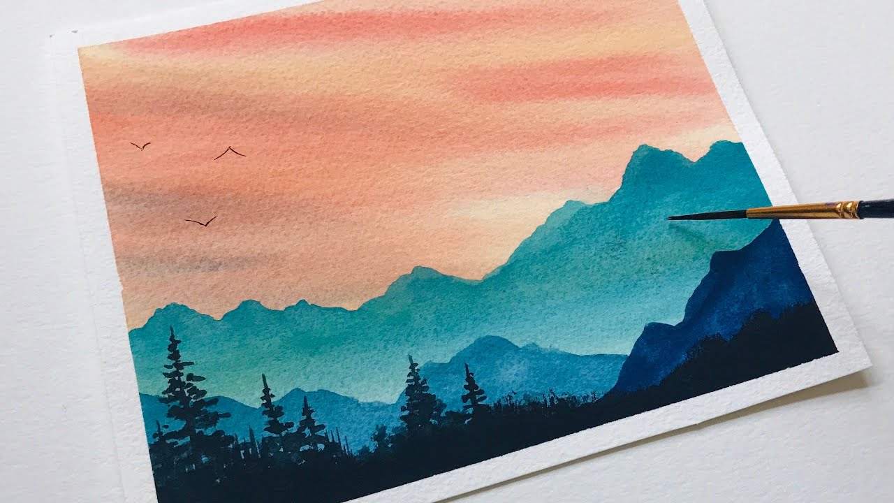
Example: When painting a sunrise, use wet-on-wet for the sky, dry brush for tree silhouettes, and masking fluid for glistening water reflections.
Credit: www.youtube.com
Step-by-step Workflow: Painting A Landscape
Following a structured workflow ensures your landscape painting progresses smoothly from sketch to final touches.
1. Reference Selection And Planning
Choose a reference photo or observe nature directly. Analyze the scene for:
- Focal point
- Value structure
- Color palette
Sketch a small thumbnail to plan composition and values.
2. Initial Drawing
Lightly sketch major elements on watercolor paper. Indicate:
- Horizon line
- Foreground, midground, background
- Key shapes (trees, buildings, water bodies)
Avoid heavy pencil marks; they can show through transparent watercolor layers.
3. First Wash (background)
Apply a light wash to establish the sky and distant elements. Use wet-on-wet for soft transitions. Let the paper dry completely before proceeding.
4. Midground Washes And Layering
Paint midground features with slightly darker values and richer colors. Employ glazing to deepen tones and create atmospheric perspective.
5. Foreground Details
Add foreground elements using wet-on-dry and dry brush techniques for crisp details. This includes:
- Trees
- Grass
- Rocks
Vary brushwork to suggest texture and movement.
6. Final Touches
Refine highlights, shadows, and small features. Use lifting and masking as needed. Step back frequently to assess overall balance and harmony.
Example: In a lakeside landscape, begin with a blue sky wash, layer gentle greens for distant hills, and finish with textured reeds in the foreground using dry brush.
Color Theory And Mixing For Landscapes
Color theory plays a pivotal role in achieving harmony, mood, and realism in landscape painting.
Understanding Warm And Cool Colors
Warm colors (reds, oranges, yellows) advance visually, making them ideal for foreground elements. Cool colors (blues, greens, purples) recede, creating atmospheric perspective.
Creating Natural Greens
Mixing greens is essential, as tube greens can appear artificial. Combine:
- Ultramarine Blue + Yellow Ochre: Earthy, natural green
- Phthalo Blue + Lemon Yellow: Bright, vibrant green
Adjust ratios to match the landscape’s mood and season.
Harmonizing Skies
Skies set the tone for the entire landscape. Mix blues like Cerulean or Ultramarine with touches of Burnt Sienna for realistic grays and cloud shadows.
Color Temperature And Light
Observe how sunlight alters color. Morning light tends to be cooler, while evening light is warmer. Reflect this in your palette selection.
| Time of Day | Dominant Color Temperature | Suggested Palette |
|---|---|---|
| Morning | Cool | Cerulean Blue, Lemon Yellow, Viridian |
| Midday | Neutral | Ultramarine, Yellow Ochre, Burnt Sienna |
| Evening | Warm | Cadmium Red, Orange, Burnt Umber |
Avoiding Muddy Colors
Mix colors gradually and avoid overworking. Clean brushes between mixes and use a limited palette for cohesion.
Example: When painting autumn foliage, use warm reds and oranges in the foreground and cooler greens and blues in the background for depth.
Real-world Examples And Case Studies
Examining real-world approaches helps clarify the watercolor landscape process and its challenges.
Example 1: Painting A Misty Forest
Artist Sarah Burns (as documented on her YouTube channel) paints misty forests using wet-on-wet for the sky and mist, layering dark greens for trees and soft lifting for fog. She emphasizes starting with light washes and building up depth gradually.
Example 2: Capturing A Sunlit Meadow
John Lovett, a professional watercolorist, demonstrates painting meadows with dry brush for grass texture, masking for sunlit highlights, and careful mixing of greens to avoid monotony. His approach shows how layering and variation in brushwork creates lively landscapes.
Example 3: Urban Landscape
In my experience painting urban parks, I found that combining wet-on-dry for architectural features and wet-on-wet for surrounding foliage leads to a harmonious blend of structure and nature. Strategic use of masking tape for clean edges improved clarity.
Pro Tip: Study examples from professional artists and analyze their process step-by-step to identify techniques you can incorporate into your own landscapes.
Troubleshooting Common Watercolor Landscape Challenges
Watercolor landscapes present unique obstacles, but understanding how to address them will boost your confidence and results.
Overworking And Muddy Colors
Repeated layering or excessive mixing leads to dull, muddy colors. To avoid this:
- Use fresh water and clean brushes.
- Allow each layer to dry before adding another.
- Limit your palette to 3-5 colors for harmony.
Paper Buckling
Thin paper warps under heavy washes. Prevent this by:
- Using 140 lb (300 gsm) or heavier paper.
- Stretching paper before painting (soaking and taping to a board).
- Working in sections to control moisture.
Hard Edges In Sky Washes
Unwanted hard edges occur when paint dries unevenly. Remedy this by:
- Wetting the paper evenly before applying sky washes.
- Tilting the paper to encourage smooth blending.
- Softening edges with a damp brush while still wet.
Loss Of Highlights
Highlights are easily lost in watercolor. Preserve them by:
- Planning ahead and leaving paper white in highlight areas.
- Using masking fluid or tape.
- Lifting pigment gently with a damp brush if needed.
| Challenge | Cause | Solution |
|---|---|---|
| Muddy Colors | Over-mixing, dirty water | Use clean water, limit palette |
| Paper Buckling | Thin paper, excessive water | Use heavy paper, stretch before painting |
| Hard Edges | Uneven drying, insufficient water | Wet paper evenly, soften edges promptly |
| Lost Highlights | Painting over light areas | Masking, lifting pigment |
Advanced Techniques And Enhancements
For those seeking to elevate their watercolor landscapes, advanced approaches provide additional expressive possibilities.
Granulation And Texture
Certain pigments granulate, settle into paper texture, creating natural effects for rocks, sand, and foliage. Experiment with:
- Daniel Smith Primatek colors
- Rough or cold-pressed paper
Color Harmony Through Limited Palette
Restrict your palette to a handful of colors (e. g. , one blue, one red, one yellow) for unity. This approach is used by many professionals to ensure color balance.
Atmospheric Effects
Enhance mood by suggesting mist, rain, or sunlight:
- Use salt sprinkled onto wet washes for texture.
- Lift pigment for cloud shapes.
- Layer transparent washes for glowing sunsets.
Incorporating Mixed Media
Combine watercolor with ink or pencil for added detail and contrast. Use archival pens for tree branches or architectural elements.
Example: In the work of Joseph Zbukvic, atmospheric effects are achieved through controlled washes and selective lifting, resulting in landscapes that feel both realistic and evocative.
For more advanced techniques and workshops, visit WatercolorPainting.com.
Frequently Asked Questions
How Do I Choose A Good Reference Photo For Landscape Painting?
Select a reference photo with clear light, strong composition, and distinct foreground, midground, and background elements. Avoid images with flat lighting or excessive detail. Online databases like Unsplash and Pixabay offer free, high-resolution landscape photos suitable for painting.
Can I Use Student-grade Paints And Paper For Landscapes?
While student-grade materials are affordable, they often lack pigment strength and durability. For best results, invest in professional-grade paints and 140 lb (300 gsm) paper. However, student-grade supplies are acceptable for practice and experimentation, especially when learning basic techniques.
What Are The Best Ways To Practice Landscape Painting With Watercolors?
Practice by:
- Creating small studies of different landscape elements (trees, skies, water).
- Painting from life outdoors (plein air) to improve observation.
- Joining online challenges or workshops for structured guidance.
Regular practice builds confidence and technical skill.
How Do I Fix Mistakes In Watercolor Landscapes?
Many errors can be corrected by lifting pigment with a damp brush or blotting with paper towels. For larger mistakes, allow the area to dry and repaint with a fresh wash. Masking fluid can preserve highlights, and opaque white gouache can cover small flaws.
Where Can I Find More Tutorials And Inspiration For Watercolor Landscapes?
Explore artist websites, YouTube channels, and specialized platforms like The American Watercolor Society. Many artists share step-by-step guides, video demonstrations, and community critiques that can accelerate your learning.
Watercolor landscapes offer endless possibilities for creative expression and technical mastery. With the right materials, foundational knowledge, and structured workflow, you can capture the beauty of nature in luminous washes and expressive brushwork. As you practice and experiment, each painting will teach you something new, embrace the process, and let your landscapes reflect your vision and experience.